Why do weather apps show different forecasts?
Different models, forecast windows, and symbols can turn the same uncertain weather into different-looking answers. Compare the details before declaring one app wrong.
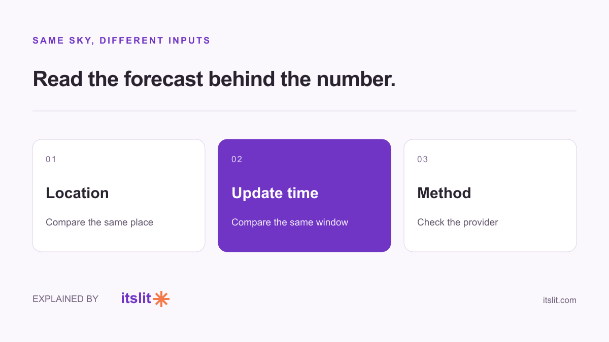
Weather apps can disagree because their forecasts come from different models or combinations of models, and because their displays summarize the forecast differently. A sun icon beside a rain icon is worth investigating, but it isn't enough to show which forecast is better.
The model is a prediction, not an observation
The Met Office explains that models differ in performance across weather types and forecast lead times. Many app forecasts are produced automatically from model data. That helps make forecasts available for many locations, but the output is still a prediction.
Weather also responds to small differences in its starting conditions. Uncertainty can grow as the forecast reaches further ahead. Ensemble forecasting explores multiple simulations rather than treating one run as a certain future.
So two precise-looking numbers can conceal a shared uncertainty. A display showing 21 degrees is tidy typography; it does not establish that 20 or 22 is impossible.
An icon compresses a lot of information
In its forecast explanation, the Met Office says a location symbol represents predominant conditions. Sunny intervals with a small chance of a brief shower can still receive a sunny-interval symbol. It recommends reading the precipitation probability alongside that symbol.
Imagine an illustrative afternoon that is mostly bright with a possible short shower. “Mostly sunny” and “some rain possible” can both describe it. A screenshot showing only two icons removes the qualification that would make the forecasts easier to reconcile.
Compare like with like
Before comparing apps, make a small checklist:
- Are both set to the same location?
- Are you comparing the same hour or the same whole-day period?
- Are the numbers air temperatures or feels-like values?
- What does each provider say its symbol or percentage represents?
This is a comparison method, not a claim that every disagreement disappears. If both forecasts really are predicting different conditions for the same place and time, the difference remains worth acknowledging.
One missed shower cannot rank every app
An illustrative fairer comparison would record both predictions before the event, then compare them with an appropriate observation afterward. Repeat for the same variable and forecast lead time, rather than remembering only the forecast that spoiled your plans.
We haven't run that test here, so we aren't naming a universal winner. The useful habit is to keep the forecast's scope attached to its number: what, where, and when.
Keep exploring: Understand rain probability.
Sources
What remains uncertain
No apps were benchmarked for this article. Provider methods, locations, and forecast periods vary, so this explanation cannot identify the most accurate app for your location.
How this story was prepared
AI-assisted article prepared using the linked sources; not independently human-reviewed. Examples labeled illustrative are invented to explain the concepts, not reported observations.